
Reimagining travel planning on Google Search
Role
UX Engineer
Duration
Summer 2024
Team
3 UX Designers
1 UX Researcher
1 Product Manager
Skills
Interaction Design
Prototyping
Concept Exploration
Research Synthesis
Overview
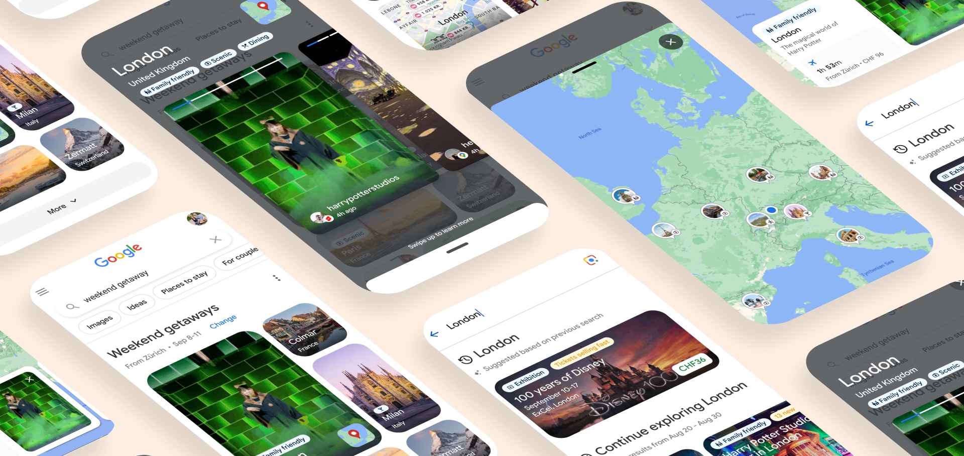
91% of travellers turned to search engines for trip inspiration, and Google was the first stop for most of them. But Search was built around a single query, not the multi-session reality of actually planning a trip. Over a summer sprint, we defined a new planning framework for Google Search that was validated by UX leadership and fed into the 2024 Google Search shift in the product roadmap, helping start the move toward more visual search results.
Problem
Search returned text-based links with no memory between sessions. Every visit started from zero. Travellers had to stitch together inspiration, comparisons, and logistics on their own, across tabs, screenshots, and half-remembered searches. The product was built for a decisive user who, in reality, rarely existed.
No continuity across sessions
The average trip takes 34 days to plan. Search treated each visit as if it were the first.
Comparison without scaffolding
Users juggled tabs, screenshots, and memory to weigh up destinations with no product support.
Inspiration without direction
The explore phase was the most loved part of planning, yet Search offered no structure to build on it.
Goal
Design a travel planning experience in Google Search that helps flexible travellers move from inspiration to decision across multiple sessions, without losing context along the way.
Research
We didn't start from scratch. Google had a large database of existing user research and I spent time going deep into it before touching a single frame. The patterns were consistent: people planning trips were flexible and undecided. Most hadn't committed to a destination, a date, or even a duration.
Three friction points kept coming up: getting inspired, comparing options without losing context, and resuming a search without starting over. Those gaps became the backbone of the framework.
Framework
We structured the work around a three-stage traveller journey, with each designer owning one stage. My primary responsibility was stage three, Rediscover the Journey. On top of that, I took on the work of pulling all three stages into a coherent experience, since they had been designed independently and looked very different from each other.

I. Get inspired
A visual, cross-vertical surface that surfaces destinations, stays, and things to do before any destination has been decided on.


Without map: Broad exploration

With map: Contextual exploration
II. Look into alternatives
Side-by-side comparisons with price signals and sustainability cues to help weigh tradeoffs without jumping between tabs.


III. Rediscover the journey
A curated view of the user's search history, personalised and kept up to date, so returning to a trip mid-planning feels like picking up a conversation, not starting a new one.


Prototyping
I always start with quick sketches to make the delivery clear, align the team early, and pressure-test the idea before investing in high fidelity.

Me in action, brainstorming with the team.
I built high-fidelity mobile prototypes in React with a live Google Maps integration, something that wasn't possible in Figma at the time, before AI tools existed to bridge that gap. The prototypes were used directly in user research sessions and made it possible to evaluate motion, map interactions, and the overall feel of the experience in a way static mocks couldn't communicate.
Outcome
Adopted into the roadmap
Concepts were validated by the UX steering committee and directly informed Search's planning priorities.
Shifted the product direction
The work helped define the 2024 Google Search shift on the product roadmap and supported the move toward more visual, cross-vertical results.
Prototype as a research tool
React prototypes with real Maps data replaced static mocks in user testing, producing sharper and more reliable insights.
A unified experience
Three separately designed stages were brought into a single coherent visual and interaction language.
The sprint ran alongside a major organisational restructure at Google, which made for an uncertain backdrop. Teams were shifting, priorities were being renegotiated, and it wasn't always clear who the work ultimately belonged to. Getting anything across the line in that environment felt like its own achievement.