Building a design system to eliminate design debt
Role
UX/UI Designer
Duration
3 months
Type
Work project
Skills
Design Systems
Developer Handoff
Documentation
Overview
In Famly's early days, engineers built the UI using an off-the-shelf UI kit to move fast. It worked until the product scaled. As the codebase grew, that approach started creating real cracks: inconsistent patterns, rising support calls, and usability issues that were hard to trace and harder to fix. The work became about replacing that foundation with something the team actually owned.
Problem
Scaling on top of a UI kit the team didn't control left visible seams across the product. Users ran into inconsistent interactions and confusing flows, which drove up support volume. Internally, engineers were patching the same things repeatedly with no shared reference to align on.
Usability gaps at scale
Patterns that worked early became confusing as the product grew, leading to a spike in user support calls.
No shared source of truth
Without ownership over the UI layer, teams made inconsistent decisions and repeated the same fixes.
Slow delivery
Engineers rebuilt common patterns from scratch each time, making even small UI changes expensive.
Goal
Replace the inherited UI kit with a design system Famly owned end-to-end — one that reduced inconsistency, made delivery faster, and gave both design and engineering a shared language to build from.
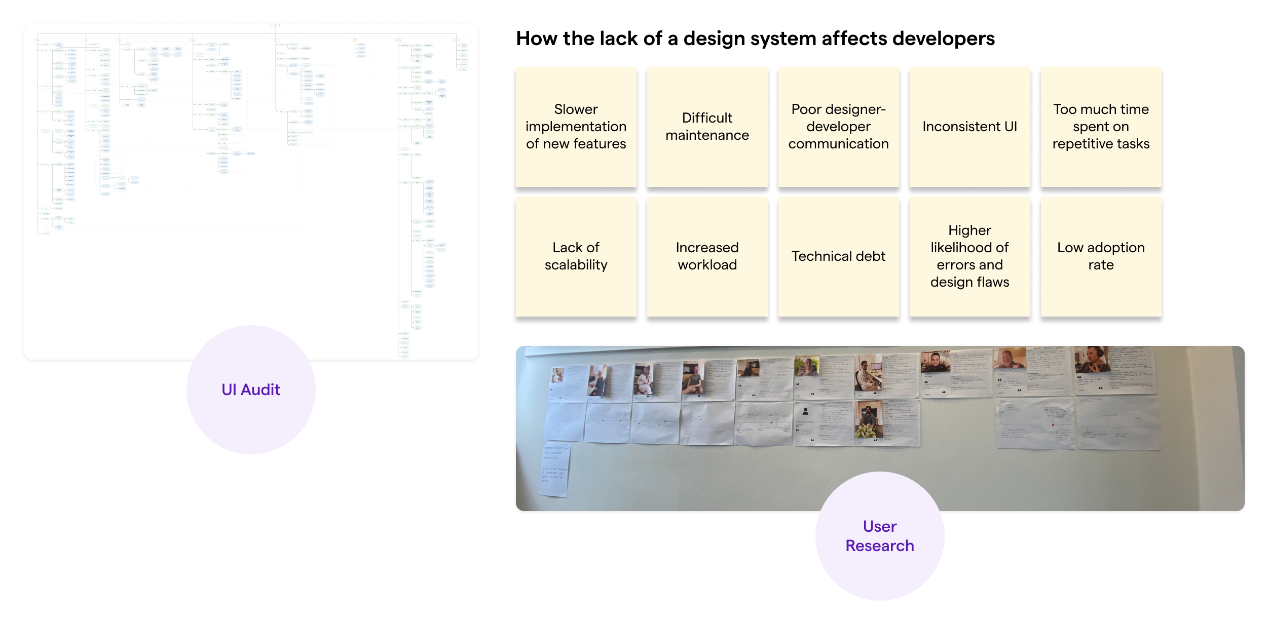
Strategy
I audited the product to find where inconsistency was costing the team, then conducted user interviews across the company to understand the biggest pain points and identify which components to prioritise first. We focused on the patterns touched most often, the ones where fixing the foundation would make the biggest difference to delivery and the user experience.
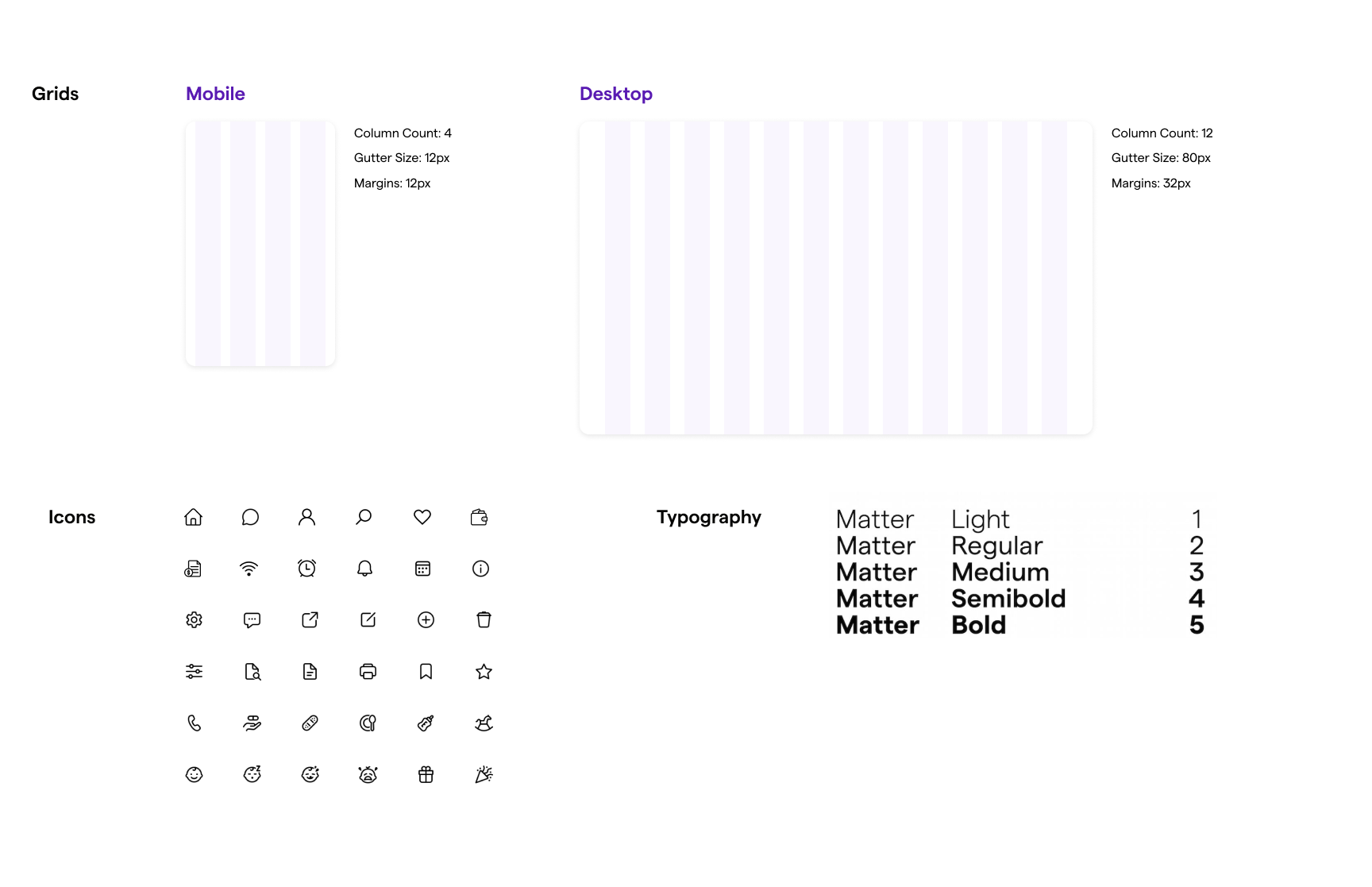
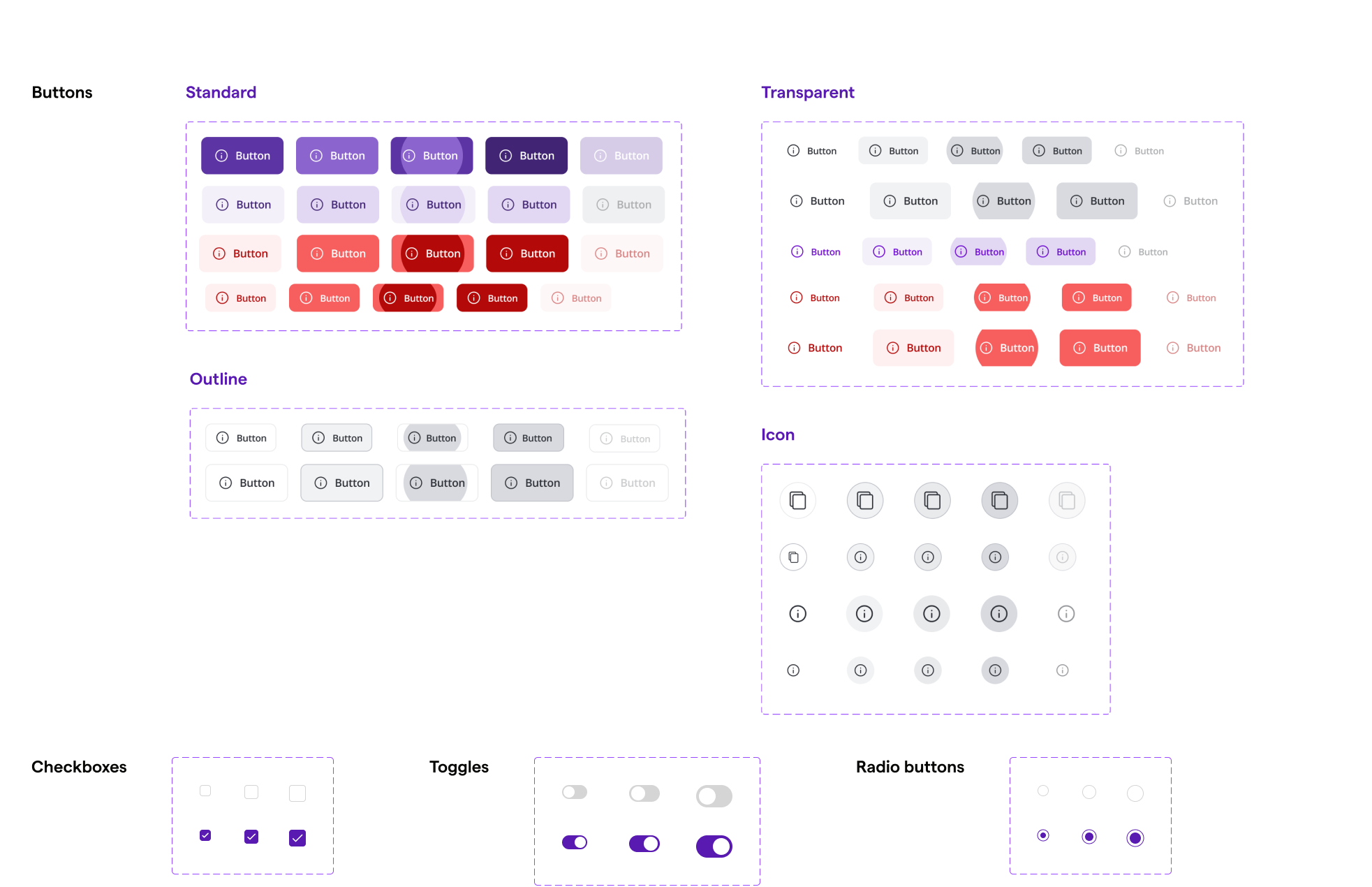
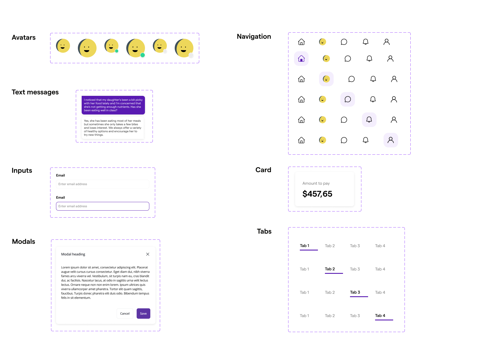
Rollout
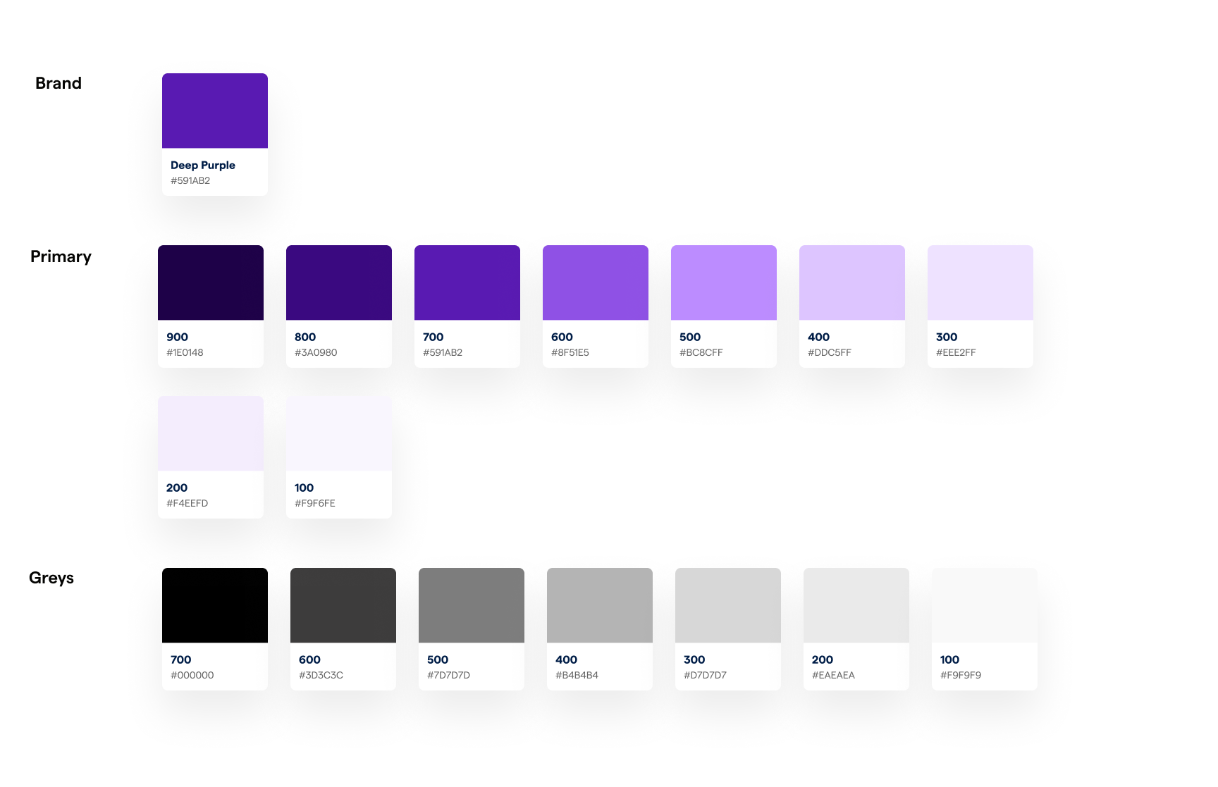
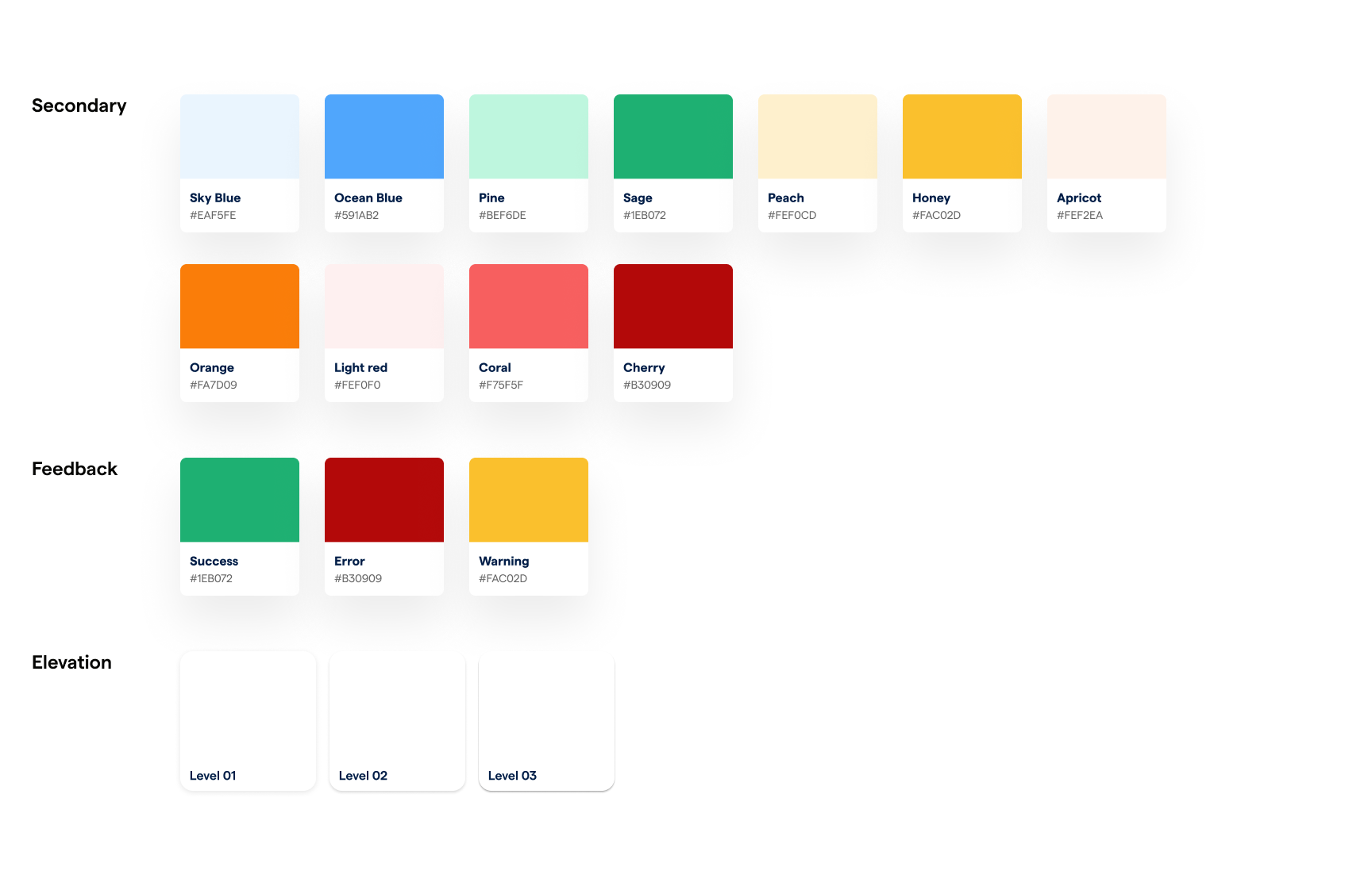
The system was built across Figma, React, and Storybook, starting with typography, colour, spacing, and the component patterns that appeared everywhere. Documentation covered not just what existed, but when and how to use it. To drive product adoption, we presented updates at the weekly company demo and shared progress through internal email newsletters so teams stayed in the loop as the system grew.
Before & After
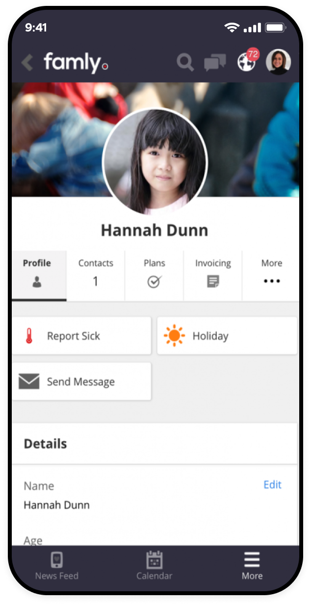
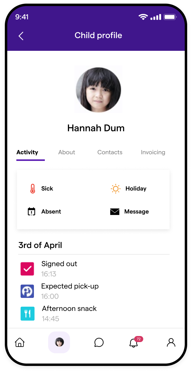
Profile page
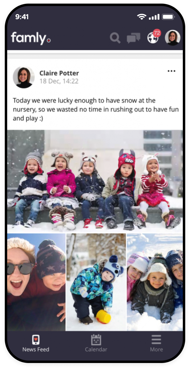
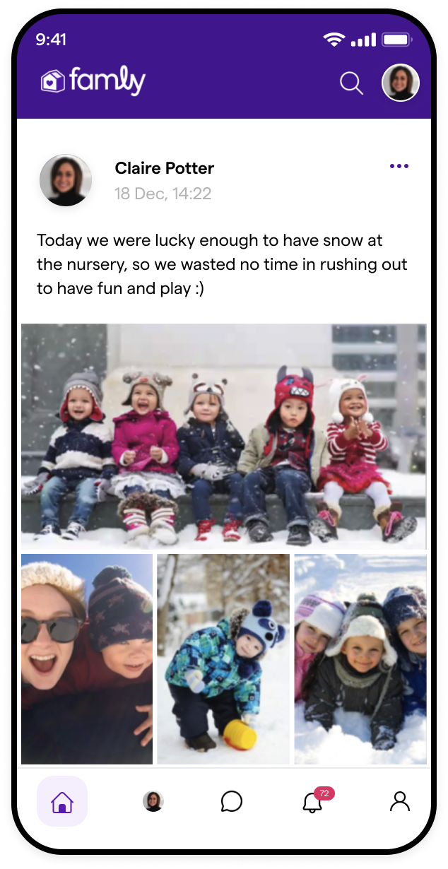
Newsfeed
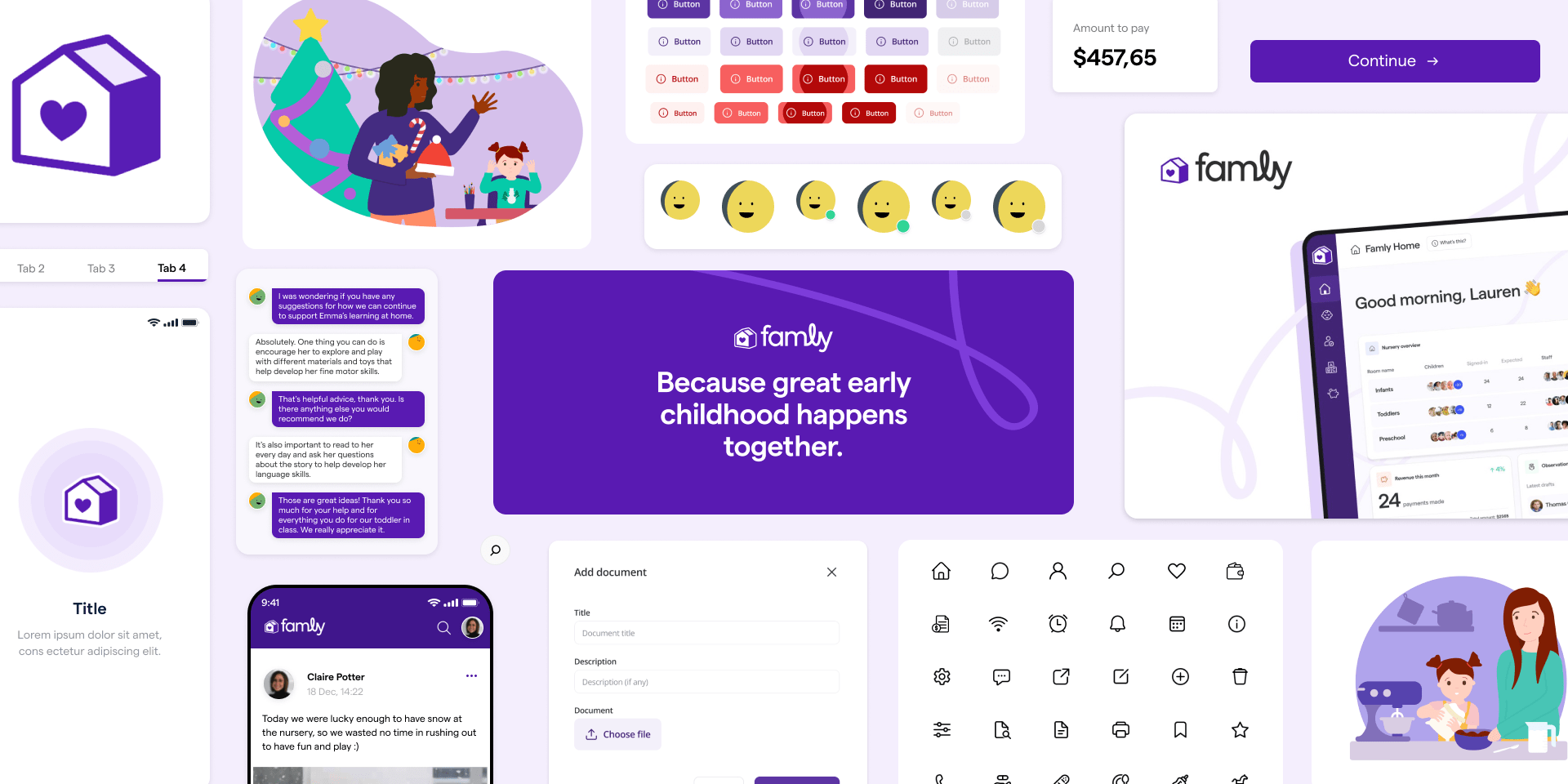
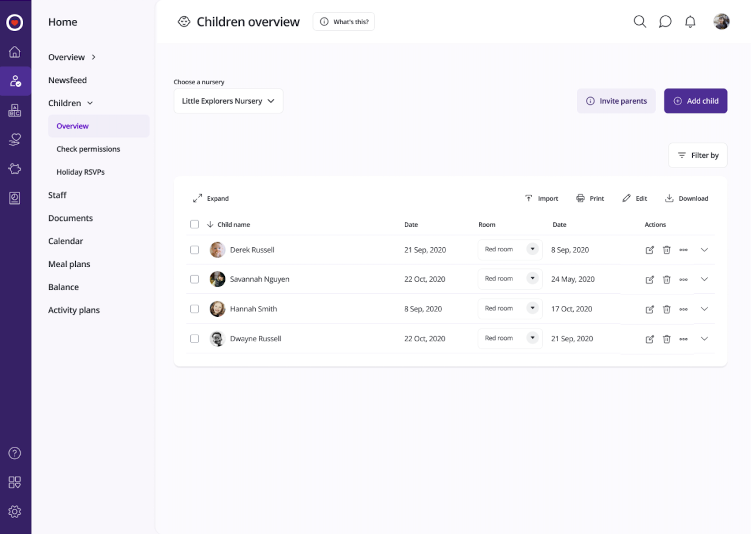
UI in Practice
Impact
35% faster UI development
Teams stopped rebuilding common patterns and spent more time shipping product work.
18% fewer support calls
A more consistent product reduced user confusion and eased pressure on support.
Stronger design-dev alignment
A shared language made handoff clearer and reduced back-and-forth between teams.
A foundation the team owns
Instead of working around a third-party kit, teams had a system they could extend and trust.