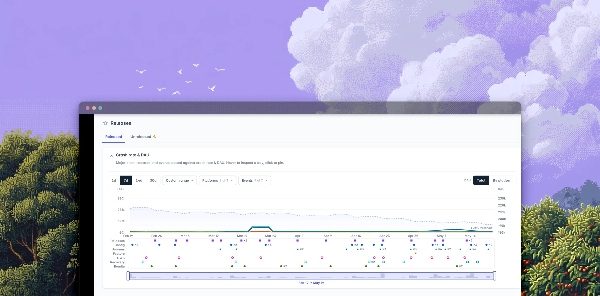
Visualizing release impact across live games
Building a release timeline to answer one question: what changed?
Role
Product Designer
Team
CTO
Product Manager
Engineers
Tools
Claude Code
SVG
Why a timeline?
On live games, when something breaks the first question is rarely why did it happen? It's what changed? A release, experiment, configuration update, or backend change could all affect the player experience. That information already existed, but it was buried in tables and spread across tools. Visual patterns are far easier to spot in a chart.
Early exploration
The initial concept: a dedicated page where teams could explore releases, events, and performance metrics together.
It gave me room to experiment with visualizing change over time.
- Dedicated timeline page
Visualizing change
My first prototype plotted releases and events directly on the chart as lollipop markers.
With a handful of events, correlating releases with crash rate and DAU was easy.
- Key metrics
- Left: lollipop markersRight: recent events list
Reality check
Production-like data exposed two problems: some games generated far more events than expected, cluttering the chart.
And investigations almost always started from the Releases page, not a separate timeline.
Both pushed the design in a different direction.
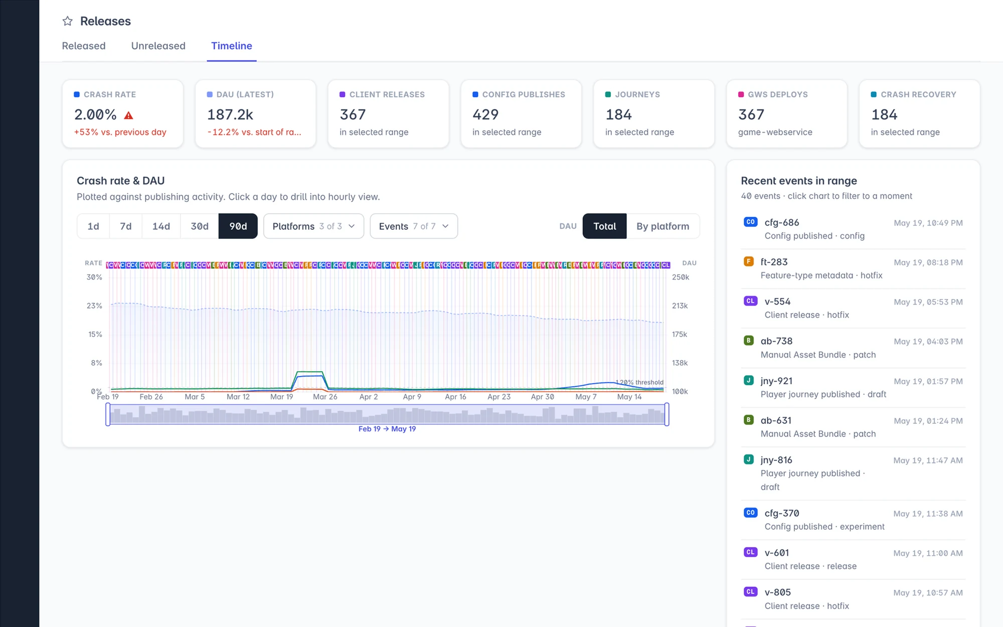
- Cluttered when too many events
Moving into Releases
Instead of a separate destination, the timeline moved into the Releases page — as a card on top of the release list, in the Released tab.
That placed it exactly where investigations already started.
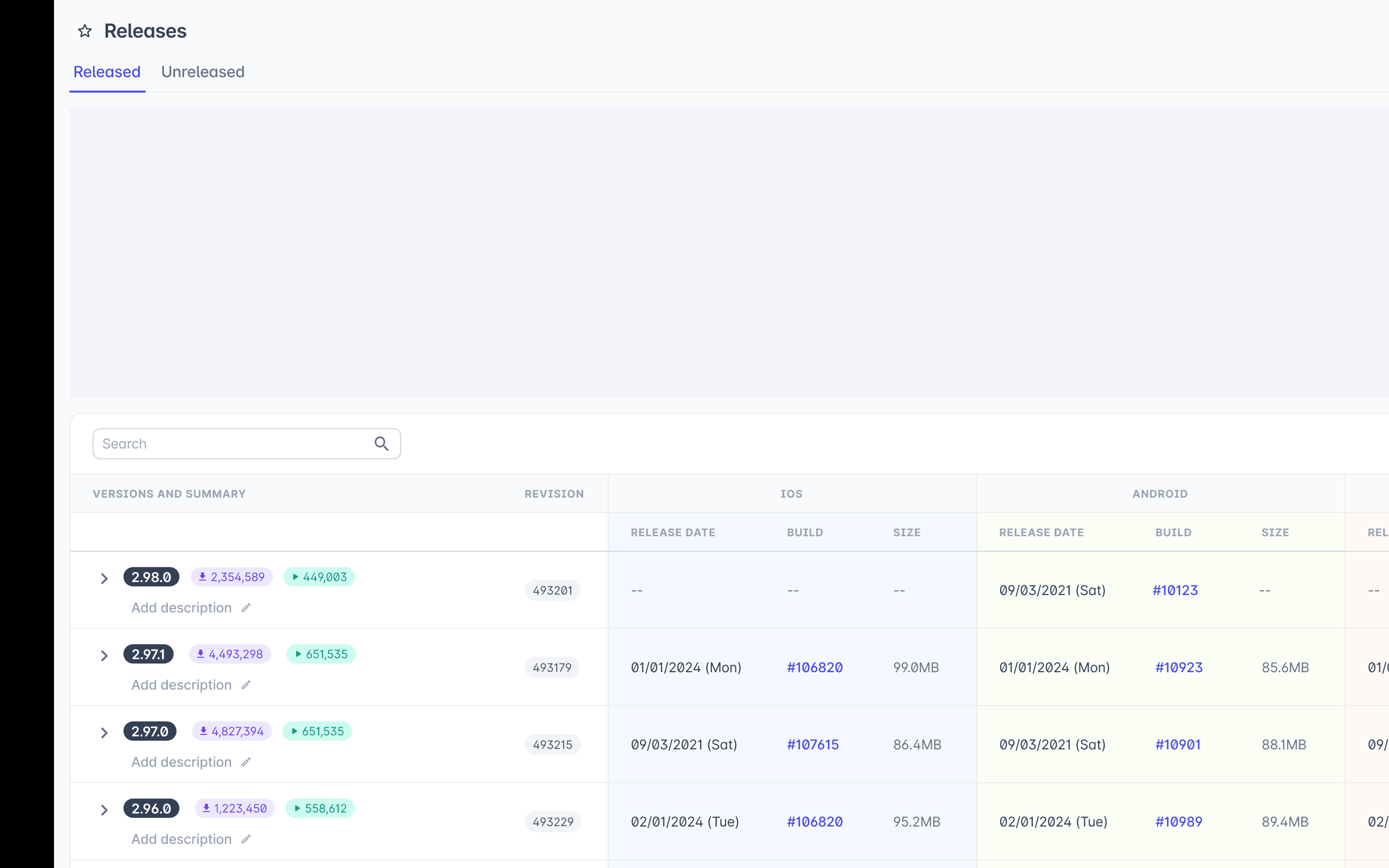
- Card on top of the Releases page
Final solution
The card is expandable, tucking away when it's not needed.
Events moved into their own lane below the chart — keeping it readable, with extra context available without leaving the existing workflow.
- Expandable card in the Released tab
- Events in their own lane
What I learned
The hardest part wasn't designing the chart. It was deciding where it belonged.
Good tools fit into existing workflows instead of creating new ones.
Outcome
A single place to answer one question: What changed?